Newsela Homepage Redesign

Our vision was to make the Newsela homepage a springboard to more meaningful engagement for teachers by providing actionable insights and recommendations to drive daily use of Newsela.
Role Lead product designer
––––––––––––––––––––––––––––––––
Company Newsela
––––––––––––––––––––––––––––––––
Team 6 engineers, 1 PM, 1 researcher, 1 copywriter
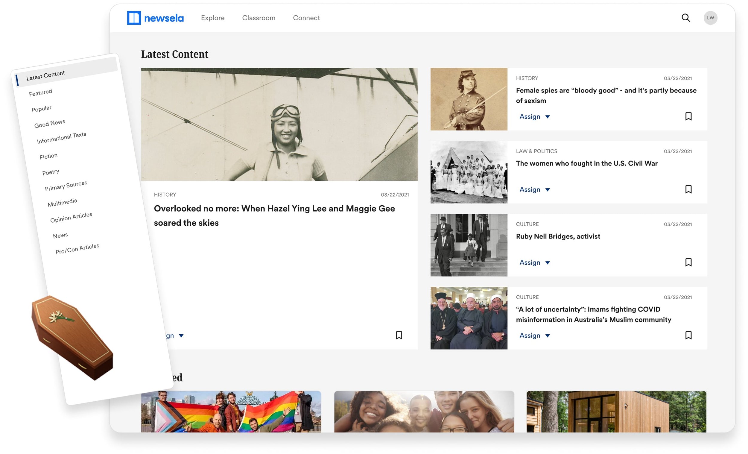
The problem
Teachers spend more time looking for content than they do engaging with it.
Users do not know how to use the product to its full extent, as demonstrated by general inactivity on the homepage and low usage of other site tools. Generally teachers struggle with finding resources and lesson ideas.
The culprits
1 - Confusing navigation
Only 12.7% of users click on the left panel nav. The nav links are jump links which might be confusing or jarring to users who expect to be taken to a new page.
2 - Irrelevant content
Homepage articles are general and therefore not always relevant to a teacher's subject forcing them to use the search feature or browse other parts of the site.
3 - High traffic, low CTR
46.3% of our traffic is direct but with a 1.93% CTR, this means almost half of our users are intentionally typing newsela.com into their browser and immediately clicking anything BUT content on the homepage.
The hypothesis
If we give users a personalized homepage with supporting content that is easily discoverable, we will drive frequency and quality engagement.
Establishing a north star
In order to create valuable engagement on the most view page of the site, we had to make a clear and intentional first impression, followed by supporting collections of content that users can skim or dive into. The thing to remember is the homepage is about piquing interests, providing initial context, and getting users into flows. The homepage is not the place for deep dive.


User testing
I worked a UXR to come up with a test plan. We tested with 6 teachers and we screened out Newsela users in an effort to get a fresh perspective on the new concepts.
Size
6 teachers
Income
40 - 100K
Age
27 - 42
Experience
3 - 20 years

The redesign release journey
STEP 1
Getting rid of dead weight
This meant getting rid of things that we knew for a fact weren’t contributing to the engagement. We ran an A/B test where we removed the left panel navigation.

STEP 2
Personalized content
I met with User Management to understand what could be pulled from account settings/preferences as well as understanding what we knew about that teacher’s school, students and district requirements. Using this info, I worked with a copywriter to personalized row headers.


STEP 3
Interactive video
Adding interactive video content to the homepage had a significant impact on the CTR.

Being blocked 🪠
Our dashboard work was dependent on the Reporting team and our curriculum overview was dependent on the Planning team. However, both teams had initiatives that took priority over our homepage efforts.

Pivoting
Without our promising dashboard and curriculum overview, I had to pivot.
I was limited to only using pre-existing content therefore I decided to come up with a design that truly celebrated the Latest News hero content.

But my design backfired 😩😩😩
The newly designed hero was performing worse than control. I looked at the differences between control and the variant and began to speculate why this was happening.

No header title
The full width hero doesn’t have a section header anymore so it’s unclear what this row is now.
Wide image hurts discovery
The wide hero image draws attention and makes other content less noticeable.
Article titles are chopped
The horizontal cards in the hero gave less real estate for their article titles.
But I fixed it
Since control was performing better than our variation, I decided to give Control a slight facelift instead of making a completely new flashy hero space.


New CTR
🏅 18.4% CTR 🏅
Overall, our experiments increase the homepage CTR from 1.93% to 18.4% over the course of 8 sprints (16 weeks ~4 months) we saw positive results.
What did we learn?
Sometimes less is more
The drop in CTR after the first hero design showed me that teachers respond better to consistency vs splashy designs.
If you build it, they will come
Increased CTR on rows below the fold let me know that teachers will scroll if they think the page as a whole is provides value.
Slow and steady wins the race
Experimental tests are effective and scrappy. We don’t have to risk overpromising and underdelivering.
Engagement is not just a homepage issue
In order for machine learning to work, we need proper user engagement across the entire platform not just the homepage.