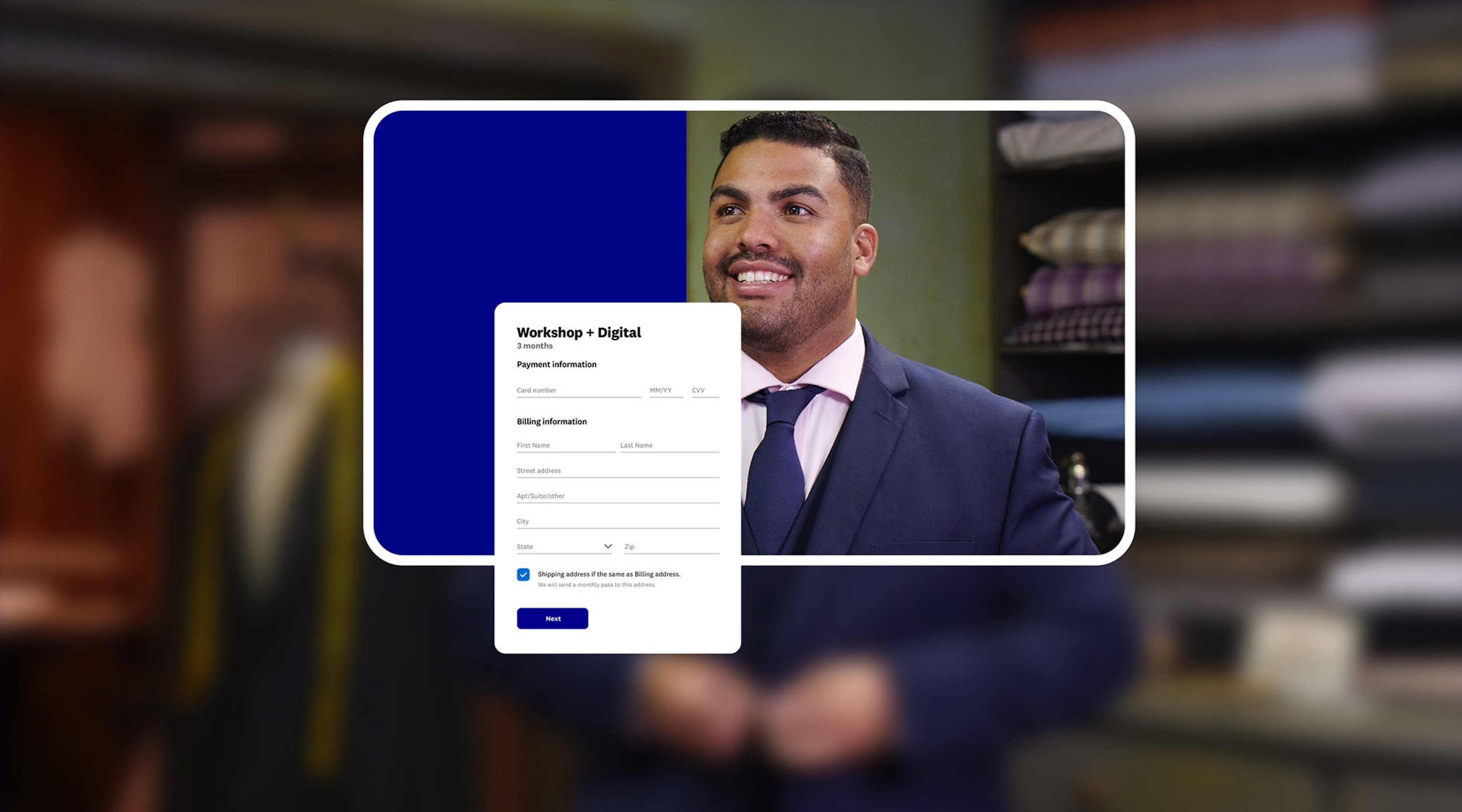
Reimagined check out experience for WW. The initial goal was to implement the new WW branding into the existing checkout funnel. However, after completing the task of reskinning checkout funnel we saw an opportunity to solve drop-off concerns.
WW Sign up & Checkout
Role Visual designer
Company WW
Team 1 PM, 1 copywriter
The problem
There was a significant drop off in the sign up funnel.
What we wanted to happen
Ideally people would come from the homepage, or email or some form of organic traffic. First they would pick a plan duration, then create an account. Next they would fill out payment information. Lastly they’d review and submit their order.
We wanted new comers to breeze through these steps with as little friction as possible.
But what was actually happening…
After entering Step 1 of the sign-up funnel people would successfully selected the plan duration and were led to Step 2.
Then…nothing. There was a significant drop off after reaching Step 2. We started to spin our wheels.
What was wrong with step 2?
We conducted rounds of A/B testing. We tested language: Was “Create your account” the right language? Were people having trouble creating a strong password? Were they frustrated with the password criteria? At the end of all the testing, I had an answer to our question: What was wrong with sign up step 2?
Nothing!
At first we were focused mainly on the sign up funnel...rightfully so, were we the “sign up team”. But we started to look at the sign up experience holistically instead of just as a 4 step funnel. We looked at the home page and other entries to the site and realized we were asking people to select a product and then select a duration, click "Join now" and then BOOM…Give us your personal info and money. People were entering the sign up funnel too soon without enough information on what they were signing up for.
What could we do?
We first discussed our drop-off assumptions with the team that owns the home page. They were able to run an A/B test with a "Learn more" button added to each product offering on the homepage. Even though this test was successful, we couldn’t rely on the home page team's copy update to solve our sign up woes because sometimes people didn't enter the checkout funnel from the homepage. So I revisited sign up step 1.
A CTA change should suffice…right?
Let’s take Step 1’s CTA language for starters. “Continue with this plan”. What does “Continue” mean exactly? Continue to purchase this plan? Continue to read more about this plan? Members were clicking that button, hoping to get more info but they didn’t. So why not just change the button to say “Learn more” and link them to a page that gives more info? It worked for the home page team. It should work for us too….right?
Wrong…
We didn’t want to link away from the sign-up funnel. Users were already there and we wanted to keep them there. Driving to a marketing page was not an option.
How might we
Add value to the sign-up process to give potential members more insight into what they were signing up for?
Adding value to step 1
Since driving to a marketing page outside of the sign-up funnel was not ideal, we decided to add value to step 1 by bringing a little bit of the marketing page to the sign-up funnel. We also thought it would be a good idea to use this exploration as an opportunity to clear up some pricing concerns people have.
Currently, we show the weekly price (because it's a lower number), but we charge by the month. Also, we KINDA tell them what they are paying upfront, but it’s not completely clear until step 4. And with all the offers and discounts, it’s hard for members to know if what they are paying upfront is the same as what they’ll be billed monthly.
We added a member image to make the hero feel more personable and warm.
Instead of tucking the amount users will pay in a drop down, we exposed this price on all plan cards making it easier to compare pricing.
We changed the CTA language from "Continue with this plan" to something less vague, like "Join with this plan". This made it very clear to members that they are about to sign up.
Added a billing cycle breakdown with dynamic dates to let potential members know exactly what they are paying today and how they will be billed from here on out.
Added marketing content such as info about the Starter Kit, WW Studios and WW app. Again, sometimes people come from more organic traffic this will give that user more context.
Since the page has the potential to get long with the marketing content, we wanted to make sure that users always have access to the product plan boxes. These animate up from the bottom of the browser as the user scrolls past the billing cycle.
Optimizing for mobile
The plans become stacked starting with the recommended plan first. Members can use the tabs to swipe through billing cycle options. Three plans also animate from bottom upon scroll due to the length of the page.
Finishing off steps 2, 3 and 4
Now that we've added more value to Step 1 which was choosing the plan, we can drop users into step 2 with way more knowledge and confidence than before.


